Thursday, October 29, 2009


References
Image1: Getty Images. "Man walking in giant maze". www.gettyimages.com
Image2: Blogspot. mazesbyDavid. www.blogspot.com
Image2: Blogspot. mazesbyDavid. www.blogspot.com
Monday, October 26, 2009


Saturday, October 17, 2009
Thursday, October 15, 2009


Monday, October 12, 2009
Draft Text.
The Vitra Design Museum is designed by Frank Ghery to display the Vitra furniture collection. During the transformation of the Vitra Design Museum, the function has been kept the same; however it has slightly altered the interaction between the designs and the viewers. Changes have been made so that both the people and the furniture are on display. A glass maze has been cut through the original structure, enabling people to walk through it and view the displays. A series of paths have been constructed which leads the people through the building. The paths placed thoughout the building are strategically placed so that the people are guided through the entire building and the entire Vitra collection. The glass maze can only accessed through from an outside entrance, and can only be exited from the same opening and the people from the inside cannot access the inside of the maze, without exiting the buildign from the regular entrance.
The inspiration behind the Vitra Design Museum transformation was Peter Eisenman’s project house VI, whereby he subtracted sections from the house which, creating an abstract form. Peter Eisenman sliced through the house exposing the structural elements. The location has been kept the same in Switzerland as it wasn’t necessary to change it for the focus of the re design. It was important to keep the function the same in order to enhance the experience for the viewers. Another inspiration that drove the alterations was Damien Hirst’s art , which involved the complete slicing of animals and then separating these cuts. This shows the structure of the inside of the animal. Similar to the redevelopment of the Vitra design Museum whereby the structure of the original building is exposed .
The main focus for the alterations was to change the interaction between the people and the designs. The way people interact with the designs and with other people around them was fundamental to the changes made. To alter the experience when visiting the Vitra Design Museum. By placing a glass maze into the structure of the Vitra Design Museum, it has changed the interaction between the design displayed and the way that people move around and view the designs. Two metal platforms levels have been placed in the maze, allowing people to move around the building on the two different levels. The tall glass wall structure alters the light inside the building.


Thursday, October 8, 2009

Research: Festival Disney


Images: Beth Dunlop. Building a dream, 1947. Harry N. Abram, Inc., Publishers. (pages 162-164)
Wednesday, October 7, 2009
Alterations
My main inspiration for changing this building is Peter Eisenman's House vi. The idea behind this house is that sections were cut out of the building, which creates an differing view and abstract interpretations of the building. My main focus is to look at the interaction of humans and the ways that they move around a set path. The Vitra Design Museum will stay the same, function wise, but I will cut out slices of the building and replace the missing section with a glass path, where people are able to move about the building, viewing the Vitra designs, the glass will also vertically to create a wall. People will also be able to walk around the inside of the building, but will not be able to access the inside from the glass path. I think the alteration this will create an interesting way to interact with the Vitra designs and will create new perspectives for the people moving throughout the building. 

Image: https://blogger.googleusercontent.com/img/b/R29vZ2xl/AVvXsEiM331yPyQHdmHyDdZzDwOGXKTBZvZsFlDt5ZDeol9gSroQwC77-OvyvBqQBp_pcsJACi4oanzRmXtUoLj_yZJrn_NCtKwUIR2PTf-AMeefE7Li6aT9UexOwiorsWVJgm4XmZS5ZLInEN0/s320/peter+eisenman+-+miller+house.jpg
Glass Maze: Path idea 


Thursday, October 1, 2009
Layout

This layout will be the first page, which introduces the Vitra Design Museum and the redevelopment of it. The Text will be describing the function and design of it before and then have a quick overview of my interpretation and the changes which i have made and the reasoning behind it.

This will be the layout for the next two pages, each of the two pages will either focus on the interior or exterior changes. The larger middle boxes will be a the model and a larger rendered image, and the smaller boxes will be different images and cross sections of the building. The text will focus on either the interior or exterior of the building.
Wednesday, September 30, 2009


Thursday, September 24, 2009
Changes to the building
My view of the Vitra Design Museum abstract and very geometric. My main focus is to change the experience and interaction people have with this building. I am reinventing the function of the building by changing both the structure and the materials. I have used Peter Eisenman's Miller house for my inspiration for the structual changes. Cutting a slit through areas of the house, experimenting with the changed interaction with the house. Also beneath the house i have decided to also run a narrow river. In order to change the structure of this building i will also need to change the materials, to support these changes. Currently the building mainly consists of white walls and concrete. I have decided to incorporate a wood structure into my building to change the mood within thid building.


Wednesday, September 23, 2009
Research: Combined

http://www.egodesign.ca/_files/articles/blocks/9463_vitra_design_museum_weil_am_rhein_frank_o._gehry.jpg

http://rseefo.com.br/wp-content/uploads/2008/07/800px-vitra_design_museum_rear_view.jpg

http://www.livingwithwhite.com/wp-content/uploads/2009/08/vitra-design-museum.jpg
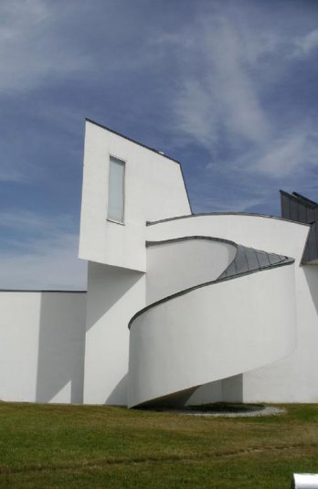
The Vitra Furniture Museum and Factory was built between 1987-1989 in Weil am Rhein in Germany. The overall design comprises of three different parts; the furniture assembly plant, the museum to house furniture collection, and the master plan of the site. What we are focusing on is the small museum. The museum includes a library, office, storage/support and exhibition space. The construction is smooth white plaster over masonary on vertical and inverted surfaces and titanium- zinc roofing panels on sloped water shielding surfaces. It is distorted but pristine painted concrete cubes. The forms appear as though they were brought together collision.The clients asked from Gehry a unified plan for a factory and museum which departed from disparate layering of geometries and informal materials common to Gehry's southern sculptural buildings. This is proved by the use of the curve in Vitra which breaks up the angularity of Gehry's previous structures. The baroque areas and gentle spirals simply collective movement responding to the dynamic nature of the manufacturing center.The sloping plaster and stucco forms resemble that of Le Corbusier Notre-Dame-du-Haut (seen below) which is in nearby Ronchamp, France. The Zinc rooftops blend in with Nicholas Grimshaw's already present factory on site which features aluminum cladding.Inside the spaces are connected volumes that spatially overlap through-out the entire building. Even though these spaces are interconnected each separate space has its own character according to the light, volume, surface and scale.
References:
Ragheb, J.Fiona. Frank Gehry, Architect. J. Fiona Ragheb, Editor. Guggenheim Museum Publication, New York 2001.
Fialova, Irena. Frank Gehry Vlado Milunic Dancing Building. Zlaty Rez, Prague 2003.
Image Sourced From:
http://comps.fotosearch.com/comp/STK/STK015/dancing-building-frank_~CWE3816.jpg
Combined research by Alison, Nissa & Cam
Tuesday, September 22, 2009
Case Study: Festival Disney, Dinseyland Paris. Frank Gehry, 1992.


"I had my own language, and because this project, I suppose, grew out of my body of work, it was sort of recognizable; it had its own sensibility. So it was complete and compact." - Frank Gehry interview
"What they wanted to do was pretty straight forward and honest. They wanted it to be specially lit and to deal ith the french skies which are mostly grey in winter. They wanted to do something that would light up this place, starting at 4p.m., and make it come to life. That's when I did the colonnade with the stainless steel and the light. The only pieces I took from theming was when we started the project, when somebody talked about the railroad and whether Festival Disney could have something to do with the history of the area and relate to the railroad. The railroad sounded interesting to me because so much passion is evoked in going to stations...That, for me, was the essance of Walk Disney...I decided to make the colonnade of Festival Disney perpendicular to the station, to the tracks. Its almost as though my row of columns was the residue of some old power station that related to the railroad. That's how I hooked into it. "- Frank Gehry interview
"He had been strongly influenced by artists...often preferred buildings in an incomplete state of construction to the finished products"
Image & Text reference:
Image & Text reference:
Edited by Karal Ann Marling, Designing Disney’s theme parks : the architecture of reassurance. Flammarion 1997, Pages 209-213
Marian Moffett, Michael W. Fazio, Lawrence Wodehouse, A world history of architecture. 2003


Thursday, September 17, 2009

Thursday, September 3, 2009


Tuesday, September 1, 2009


Subscribe to:
Posts (Atom)
